

Aristae is a brand that sells premium spices for every day people who want to spice up their every day meals.
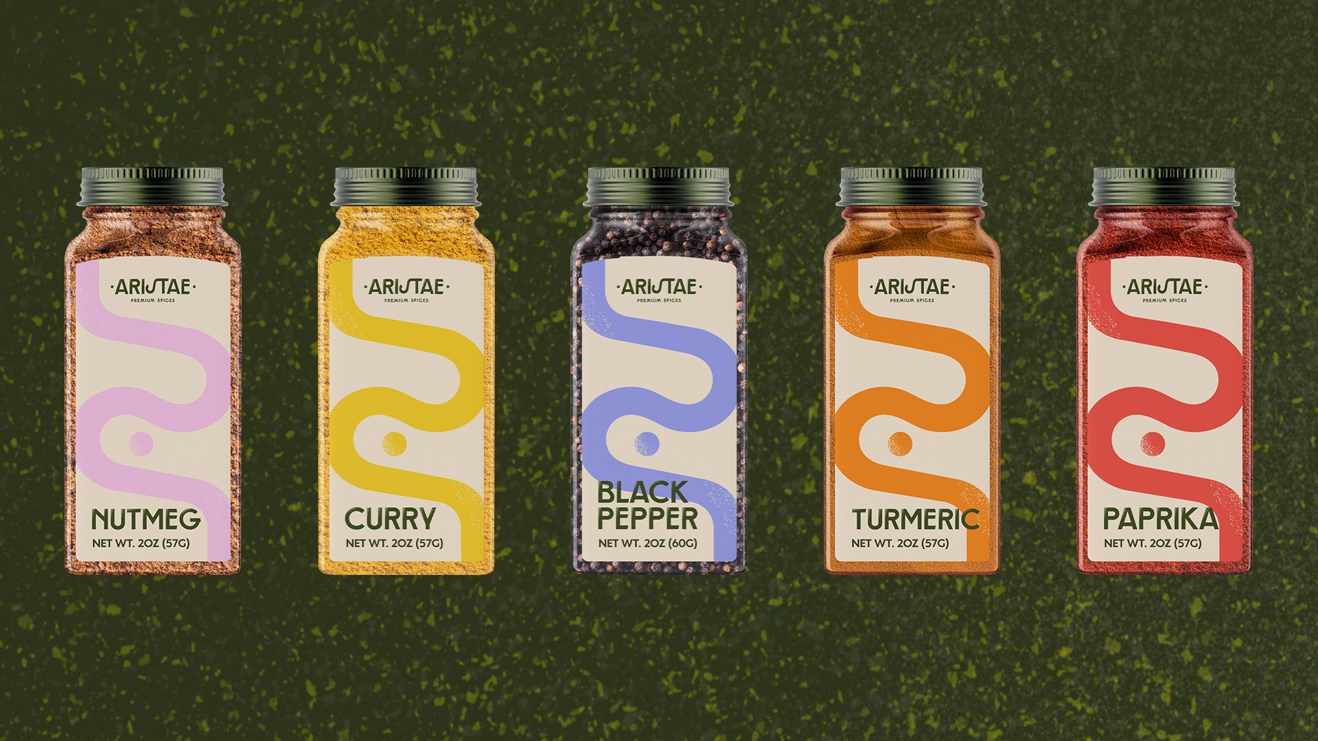
Working on Aristae allowed me to explore the world of abstract illustrations and - for once - put aside the focus on the type. For this project, I wanted clean classic typography and textured illustrations that would represent the spices and what they can do.
PROJECT TYPE:
Passion project
SERVICES:
Brand Strategy; Brand identity
KEYWORDS:
Elevated, Trust-worthy, Confident
DELIVERABLES:
Creative direction; Custom typography; Illustration design; Brand application; Packaging design; Poster design
MISSION
Their brand mission is to encourage experimenting with lots of different flavors, taking the pressure off inexperienced cooks and making the experience fun and enjoyable!
TARGET
The target for Aristae is anyone who’s interested in spicing up their meals, but more specifically younger people - as they have less experience and might feel intimidated to try something new.
PERSONALITY
Aristae is elevated and trustworthy, but it still has a fun and playful personality, which is at the core of the brand. Taking risks and being adventurous with food is what the brand is all about.

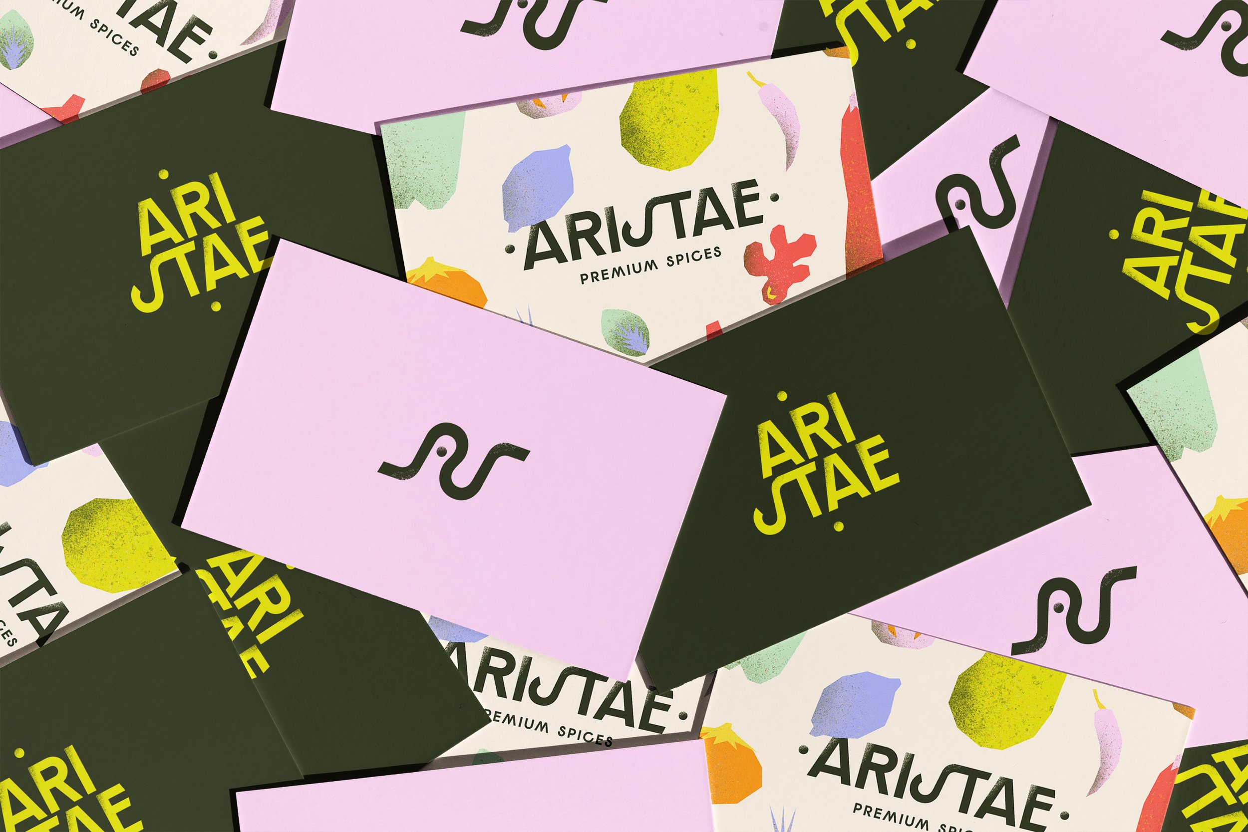
LOGO DESIGN:
The typography is very clean and geometric, to add to that elegant and refined feeling the brand has. The S and the T are connected, to make the composition more interesting and take away some of the sturdiness from the letters, while the textured shadow connects the logo design to the brand’s purpose and mission.


BRAND ASSETS:
The illustrations are bold and colorful, creating contrast with the clean typography in the logo. The texture is used to visually represent the act of spicing your food and the effect that it has on your meals. The colors are purposefully unrealistic, to encourage experimenting with different flavors and evoking a sense of adventure and surprise.


WATCH THE DESIGN PROCESS

Let’s be besties on Instagram!


