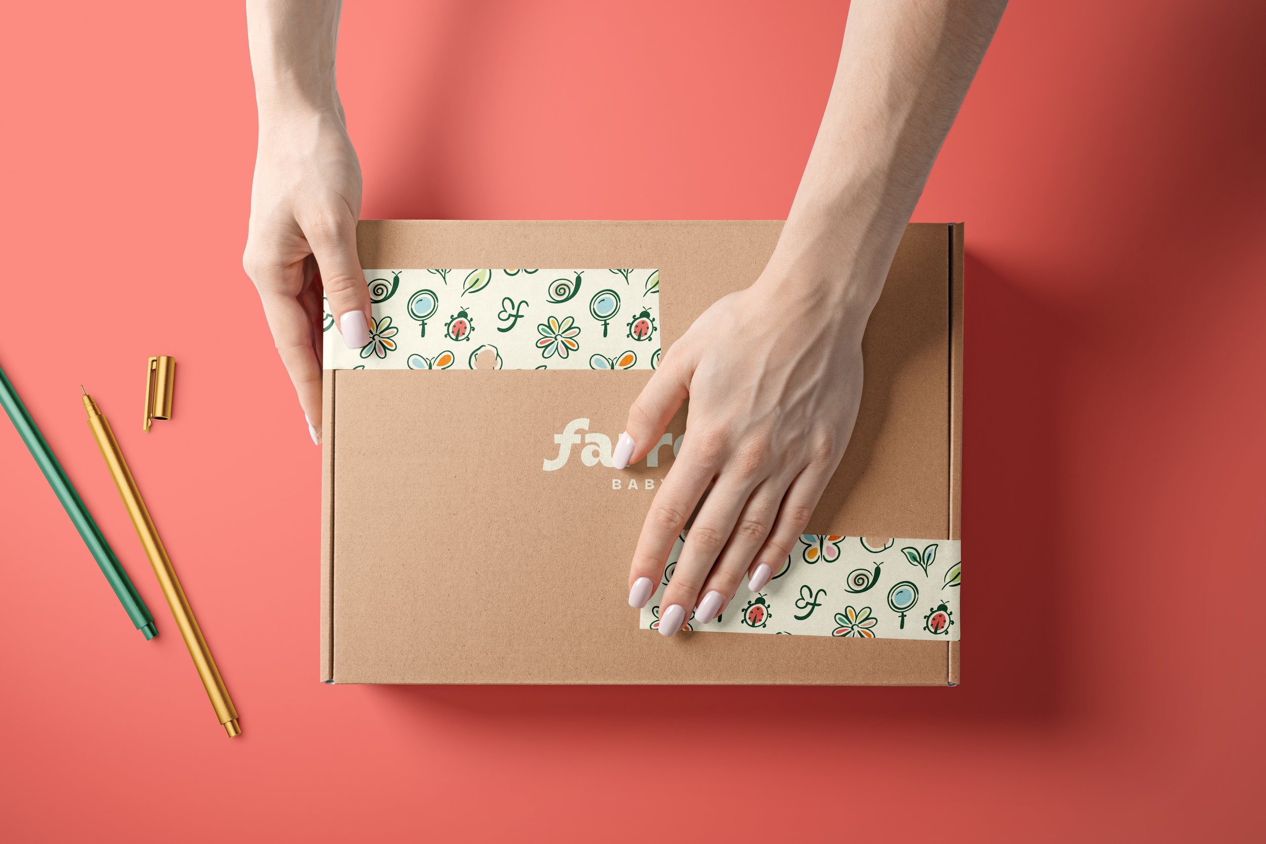
Farren Baby is a clothing brand that sells soft clothes for children, designed for each developmental stage. The brand follows the Montessori philosophy and values the relationship between nature and the child, bringing this ideal into the garments.
The founder came to me with a vision for her business to become the go-to brand for parents and gain their trust and loyalty. To achieve that, we needed to completely rebrand her business - aligning it with her core values and mission.
PROJECT TYPE:
SERVICES:
KEYWORDS:
Client project
Visual Identity
Inviting; Natural; Fun
DELIVERABLES:
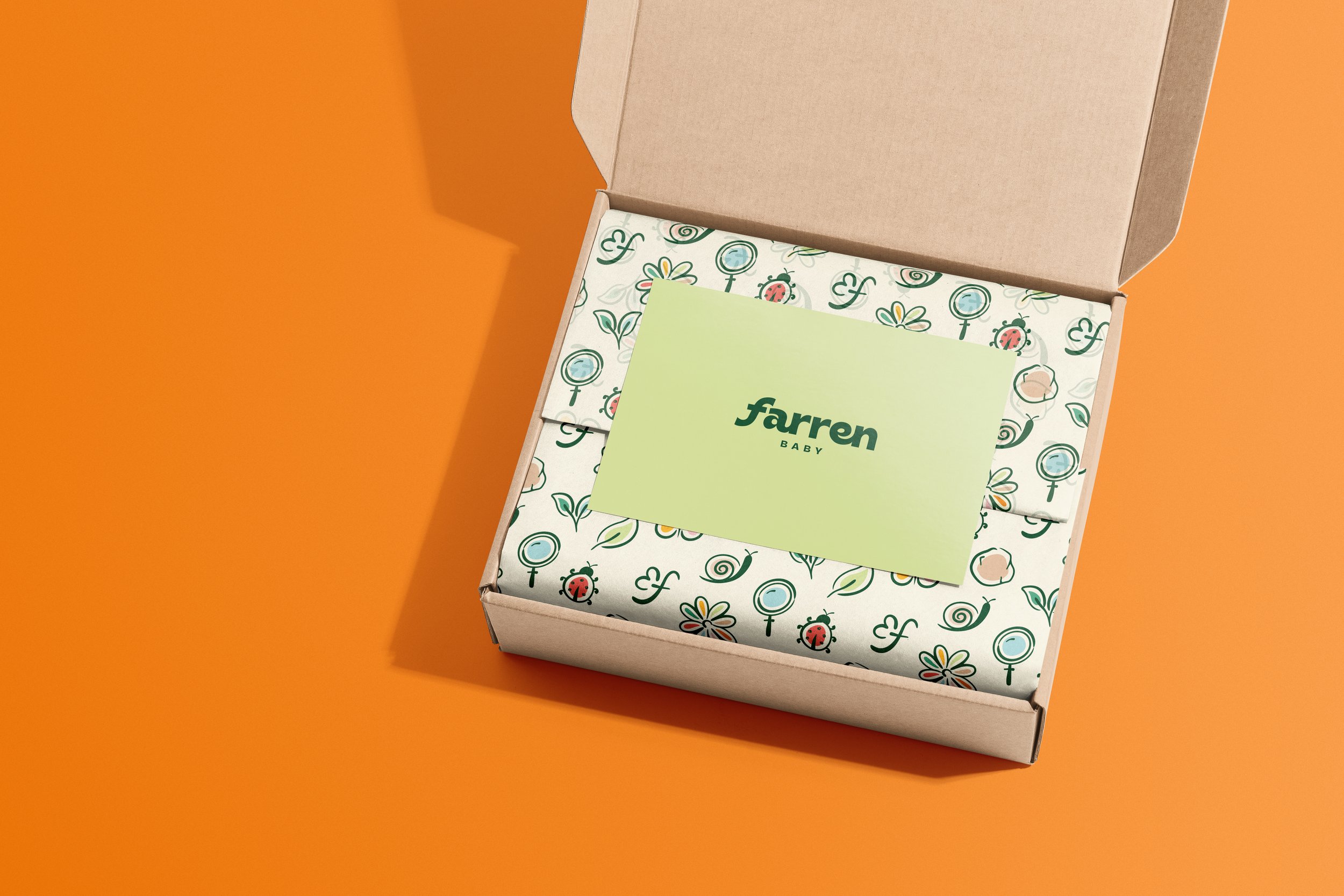
Creative Direction & Moodboard; Custom Typography; Illustrations & Icons; Packaging Design

LOGO DESIGN:
The letter F is completely custom and has been manipulated using parts of the letter R. The letter was tilted to give movement to the logo and make it dynamic: this movement represents the constant growth of the children using the brand’s products and their independence.

BRAND ASSETS:
The pattern features all the brand illustrations and the brand mark. The illustrations were made using a textured brush, giving them a hand drawn feeling and they represent various elements of nature. The lines and shapes create doodles that are completely unique to the brand and make it clear that it’s a children’s brand.
“So lucky that we were able to work with you on our branding adventure, Viviana! Thank you for everything!! The illustrations are our favorite!”


